If you’re wondering what Apple’s visual design language is going to look like in the coming years, we may now have a solid idea — and it’s all down to some new iOS icons.
Go on, have a look at the updated design for Apple Music for Artists app:
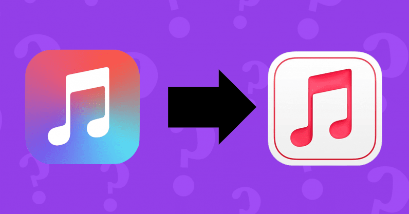
This new iOS icon was first spotted by Reddit user DimVl. It appears to mimic (or echo, if you’d prefer) some of the design choices we saw appear in Big Sur. Specifically, the emphasis on icons with greater depth, as you can see the shadowing of the double quaver giving the new app logo a more three-dimensional look.
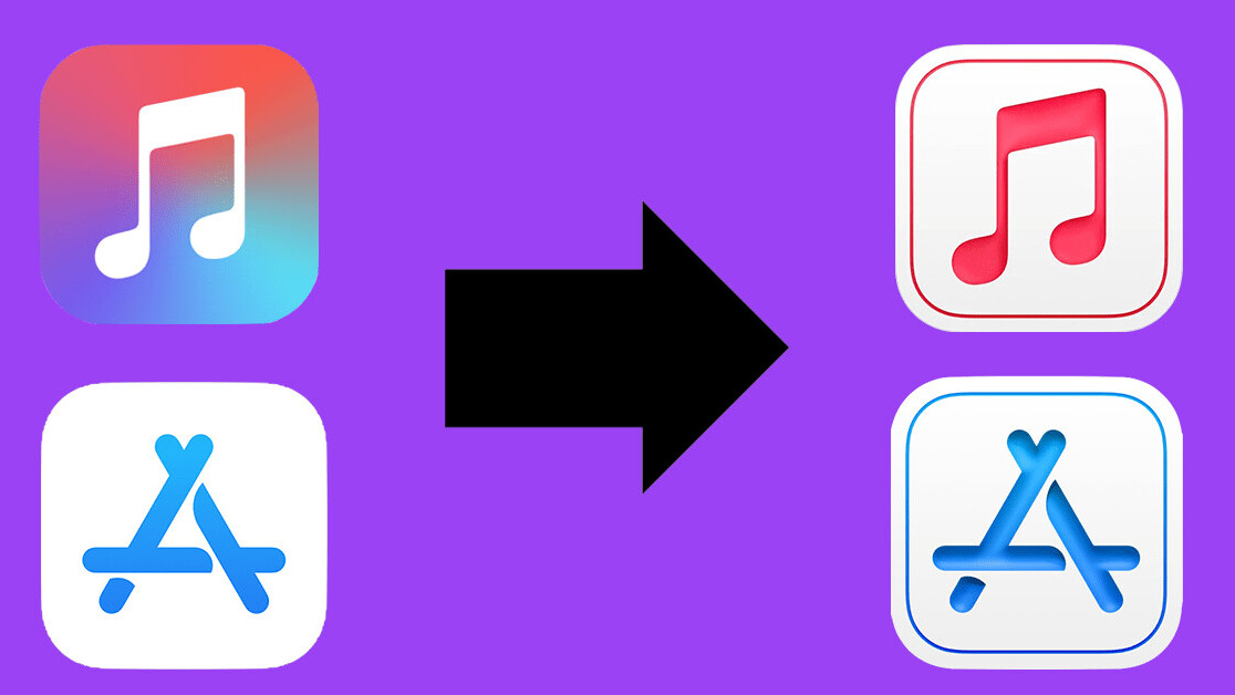
While we can’t say for sure that this new iOS icon is the future of Apple’s new design language, this isn’t the first evidence we have of this particular shift. In fact, as spotted by MacRumors, Apple did a similar thing with the App Store Connect logo last year:

The same design language across the pair is clear — and heavily suggests this is what iOS 15 may look like. This approach isn’t technically neumorphic, but the company is clearly taking some cues from that school in order to move away from the flat design it’s been using the past several years. The end result appears all about depth.
What’s also interesting with these two new iOS icons is the color scheme. While the App Store Connect logo has kept the same background, the Apple Music for Artists icon has become clear white.
One possible explanation for this is dark mode functionality, the idea being that the background of the icons can switch to black when this is enabled. Clever, if true.
Let’s all take this with a pinch of salt though. While Apple is due for a redesign with iOS 15, it doesn’t necessarily mean the two icons we’ve seen above are any indication of what’s to come.
But — and let’s be honest — I’d be surprised if the similarity between these two iOS icons are completely random and not a sign of Apple’s future design language. Now, excuse me, I’ve got to go and count the days until the iOS 15 announcement.
What do you think of the new iOS icons? Let me know your thoughts on Twitter.
Get the TNW newsletter
Get the most important tech news in your inbox each week.

