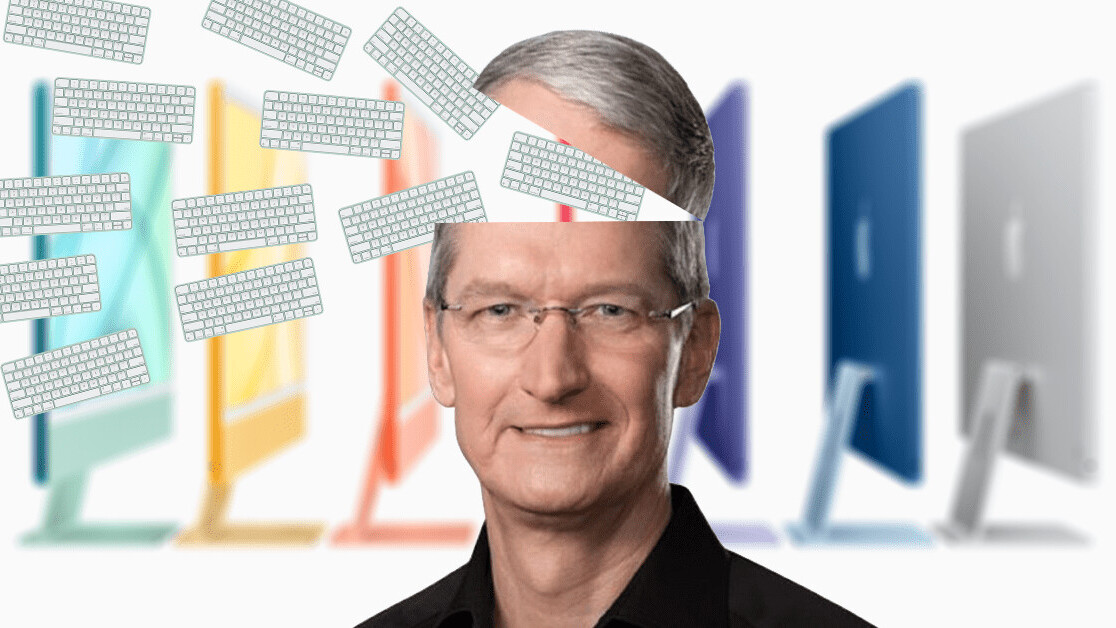
Look, I know it’s been a few days since the new iMac was announced, but I can’t get it out of my head. And, to answer your obvious question: yes, I am a ridiculous man.
I’m not gonna sit here and say the new iMac is perfect. In fact, there are a range of issues with Apple’s new computer. One that’s constantly brought up is the chin and bezels on the devices. First though, let’s get reacquainted with the new machine:
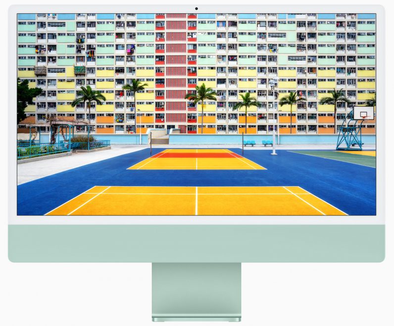
There’s one question I have about that huge, jutting chin underneath the screen: why? Well, I actually have an answer: that’s where the fans are.
The reason for this is because the device is so thin. Did you know Apple had to put the headphone jack on the side of the new iMac because the connector is longer than the computer is thick? Well, you do now.
In other words, Apple made the new iMac so slim that the chin was the only place it could put the fans. And because of that we’re left with this massive, dumb looking thing that serves no aesthetic purpose.
Now, let’s talk about the bezels.
You notice something about them? Yep, they’re white. And can I ask you to go and look at basically any other device with a screen and bezels? Correct: they’re all black. This is down to the fact that dark colors absorb light, which means they fade into the background when you’re looking at a screen. White bezels don’t.

This is what we call design over functionality.
Then, of course, we have the usual Apple bullshit when it comes to upgrades. Want to upgrade from 8GB RAM to 16GB? That’ll cost you $200. Want a 1TB SSD over a 512GB one? Another $200 please. If you’re being generous, Apple is only doubling the cost of those components.
But you know what? I don’t really care. I’m in love with the new iMac.
I adore the design, the richness of the screen, the size, the new color formats, almost everything, really. Could you find a more functional computer for less money? Of fucking course you could — but the new iMac is a piece of art. And, by god, I want one.
Yet there’s one element I can’t get over: and that’s the new Magic Keyboard. Here it is:
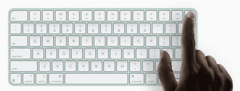
On the surface, there’s absolutely nothing wrong with it. The new Magic Keyboard looks greats, matches the new iMac perfectly, and the introduction of Touch ID is pretty damn useful.
But… why are the keys white? Whoever decided that, stop. Please. Please stop. Forever and ever, stop.
I’m not sure if you’ve ever owned a white keyboard, but it’s the worst. No matter how much you clean it, the thing gets grubby and nasty shortly after. It only takes days for the sparkle to disappear and the grime to move in.
This color keyboard isn’t a new thing for Apple — the company has been putting things out in this shade forever. But you know what? They’re all horrible.
The solution would be so easy: offer two different keyboard colors. White for the misguided, and something darker for people who understand how filthy and disgusting these things get.
And yes, I’m aware that you can clean the Magic Keyboard, but I’d also like to point you to the phenomenon of yellowing. It won’t take long until nastiness is simply part of it.
In a way, my issue with the Magic Keyboard is thematically similar to many people’s problems with the new iMac: that the company focused on form over function.
For some reason though, I can overlook that on the computer itself. But when it comes to the hardware I’m gonna be actually touching all the time? I simply cannot. Get in the sea.
Get the TNW newsletter
Get the most important tech news in your inbox each week.
