The Apple Watch is a thing of absolute beauty. But, while using the Series 6, I was struck with a thought: will the Apple Watch design ever actually change?
The Curpertino-based company isn’t exactly known for left-field approaches to product design. It’s all about evolution, about tinkering and perfecting. This leads to clear aesthetic growth across its products.
Well, in everything but the Apple Watch.
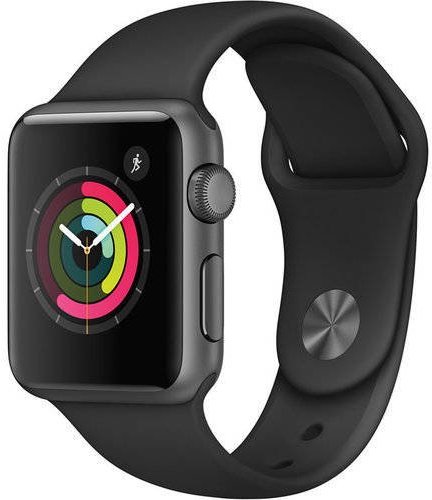
Don’t believe me? Well, have a look at the Series 1, released all the way back in 2015:
And now compare that to this year’s Series 6:
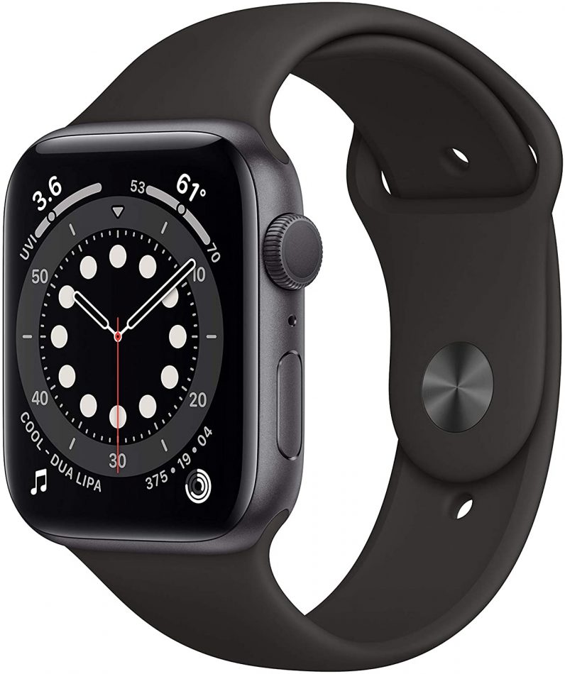
They’re remarkably similar. The Side button is now flusher to the body, and the actual size of the Apple Watch has changed too (from 38mm and 42mm, to 40mm and 44mm). But apart from that? It’s strangely consistent.
And, just to note, I’m talking about external design here — obviously the innards of the Apple Watch have advanced considerably across the five years.
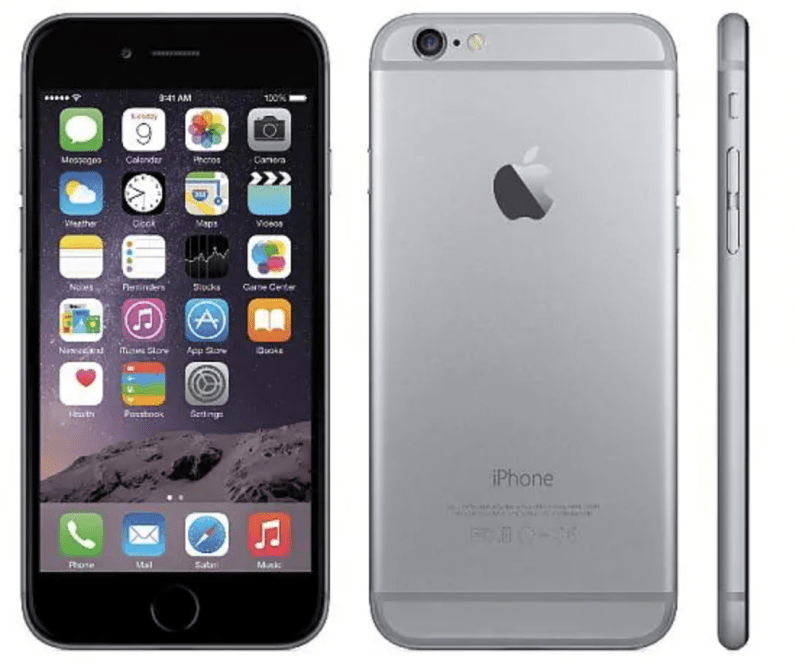
To provide a comparison, look at the iPhone 6 design (which was released in 2015):
And 2020’s iPhone 12:
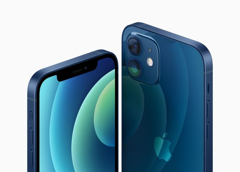
Even just a cursory glance between the two pictures shows a huge number of design evolutions — far more than Apple’s flagship wearable has undergone.
So why has the Apple Watch design stayed so similar?
If we’re going to understand where Apple may go in the future with the Apple Watch design, we have to know why it has stayed so static.
There are three main reasons: brand, function, and customizability.
Reason 1: brand
The Apple Watch’s design has become classic.
Think of it as akin to AirPods. Apple wasn’t the first company to create a product in that vein and shape, but it popularized it. The Apple Watch owns people’s brain space. It’s recognizable, something you can spot from afar.
This is so advanced that you can guarantee any company creating a square-ish smartwatch will receive accusations of Apple Watch plagiarism — whether that’s fair or not.
I could see Apple throwing away this level of product recognition, but to achieve this, it requires a better smartwatch design to move to. And this is where function comes in.
Reason 2: function
There’s a reason that most screens are rectangular: it’s simply the most efficient shape for displaying information.
If you’re designing a smartwatch you generally have two choices: a quadrilateral like Apple’s, or something circular like the Samsung Galaxy Watch.
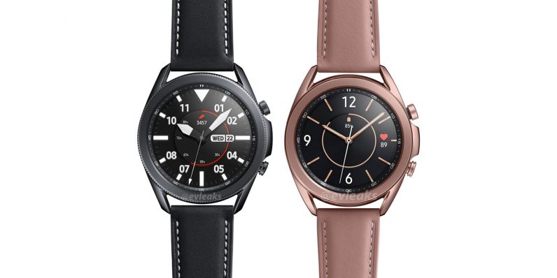
As great as Samsung’s wearable is, it’s simply not able to function as second screen in quite the way the Apple Watch can. And this is a deliberate move. I believe Samsung chose to forge its own path and diverge from Apple by creating a wearable that aligns more with standard watch design. In other words, it forgoes some elements to thrive at others.
Now let’s think about Apple. Could you imagine how bad the PR would be if the company backtracked on the fundamental principles of its own Apple Watch design? But it gets worse. If Apple did change its wearable’s shape to something more circular, it’d somehow need to offer better functionality with it than its current shape.
Which is impossible.
Reason 3: customizability
This is the reason why Apple has managed to keep its Watch design so similar without a huge public uproar.
Throughout the course of putting this piece together I realized something: the Apple Watch is designed to be a canvas. It’s designed to be paired with bands and straps, meaning that the users themselves can “design” it themselves.
Simply, there’s no other Apple product you can change the aesthetic of so readily.
You have fancy metal clasps, classic leather ones, comfortable material straps, sports bands — and that’s just talking about what Apple offers, let alone third party options. If you want to get a feel for the variability, have a look here. Or on Apple’s store.
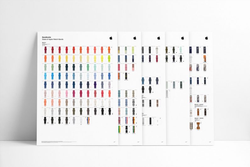
When you consider this flexibility it’s clear why the body design has barely changed: it doesn’t have to. There are an almost unlimited amount of aesthetic options out there — and Apple can always just implement more.
Effectively, the Apple Watch design is clean and functional enough that it allows users to imprint their own personalities onto the device. Why shoot for a crazy design if this is the goal?
What’s the future of the Apple Watch design?
Throughout the piece, we’ve already discounted a few things. We know, for example, that Apple is unlikely to move to a circular design or change the shape in any drastic way.
I was wondering about whether it would try and expand the screen so it goes round the edges of the device — similar to OPPO’s waterfall display — but I imagine those curved points would be too susceptible to damage.
I’ll be honest: beyond tweaks like a bigger screen or thinner profile, it’s tough to imagine Apple making wholesale design to the Watch’s design. At least until technology advances.
Let’s look at an exciting entrant into the wearable market as an example: the Nubia Watch — a device I’ve had the pleasure of using. Effectively, it’s a smartwatch with a flexible screen, so it bends around your wrist.
While the quality of the touchscreen display isn’t fantastic, it is impressive — and potentially a signifier of things to come for the industry. I could see Apple incorporating flexible display technology into the Watch at some point.
Just not soon. In a decade we may see an Apple Watch design that’s substantially different, but I wouldn’t bet much on it. And that’s the key thing here.
Apple is in no rush to change its wearable’s design. It’s functional, it’s recognisable, and it’s beautiful. Its sales are increasing and it seems more popular than ever.
Fundamentally, why fix something that ain’t broke? And the Apple Watch design is in rude health.
Get the TNW newsletter
Get the most important tech news in your inbox each week.
